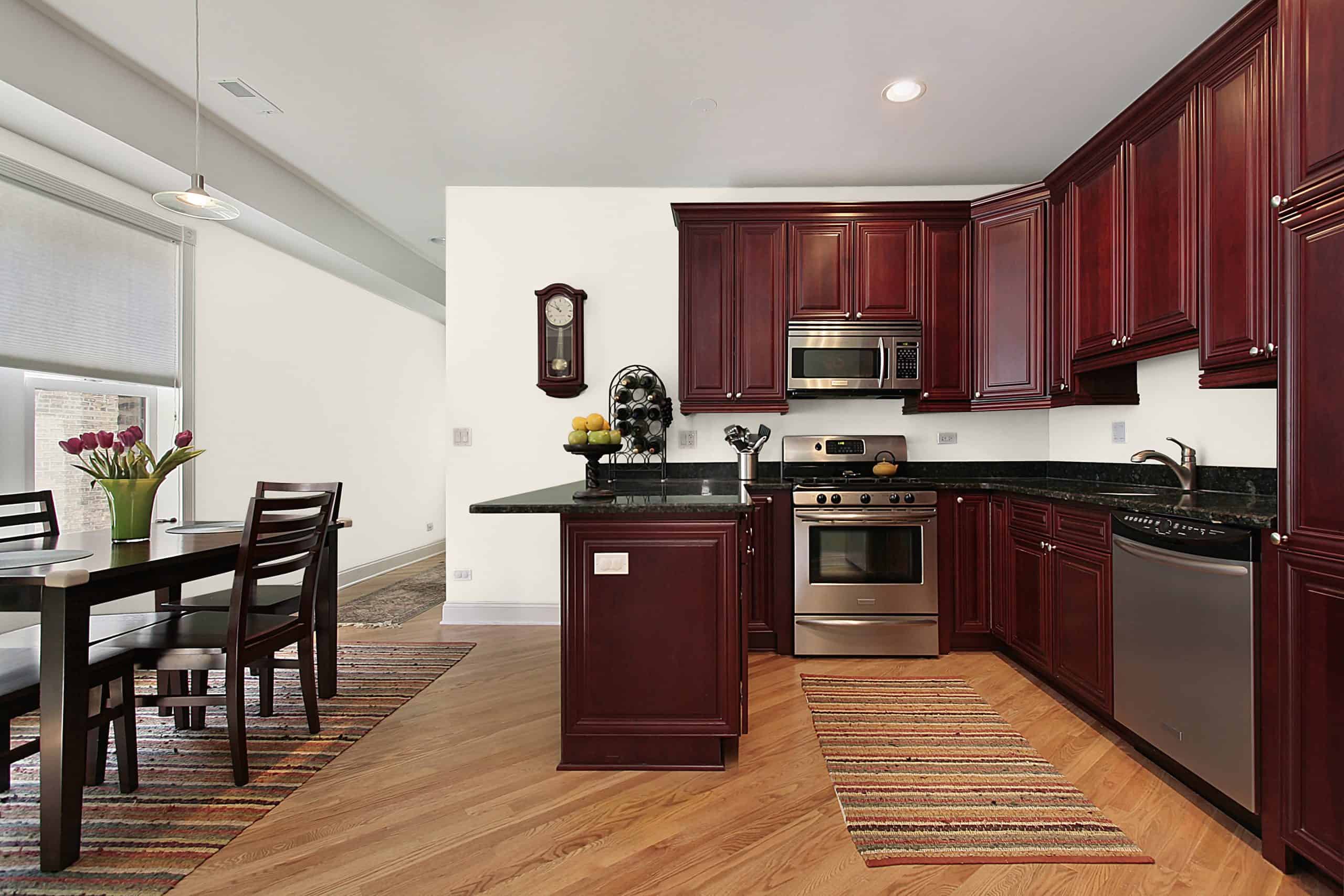
10 Best Wall Paint Colors that go with Cherry Cabinets
Cherry cabinets aren’t new to the market but have managed to stay in-trend for decades thanks to their undeniable charm. However, their fiery appearance makes it difficult to find the right complementary wall color.
If you’re looking for the best paint color with cherry cabinets, you’re in the right place. Below is a collection of popular kitchen color schemes with cherry cabinets to try at home:
Reclining Green by Sherwin Williams
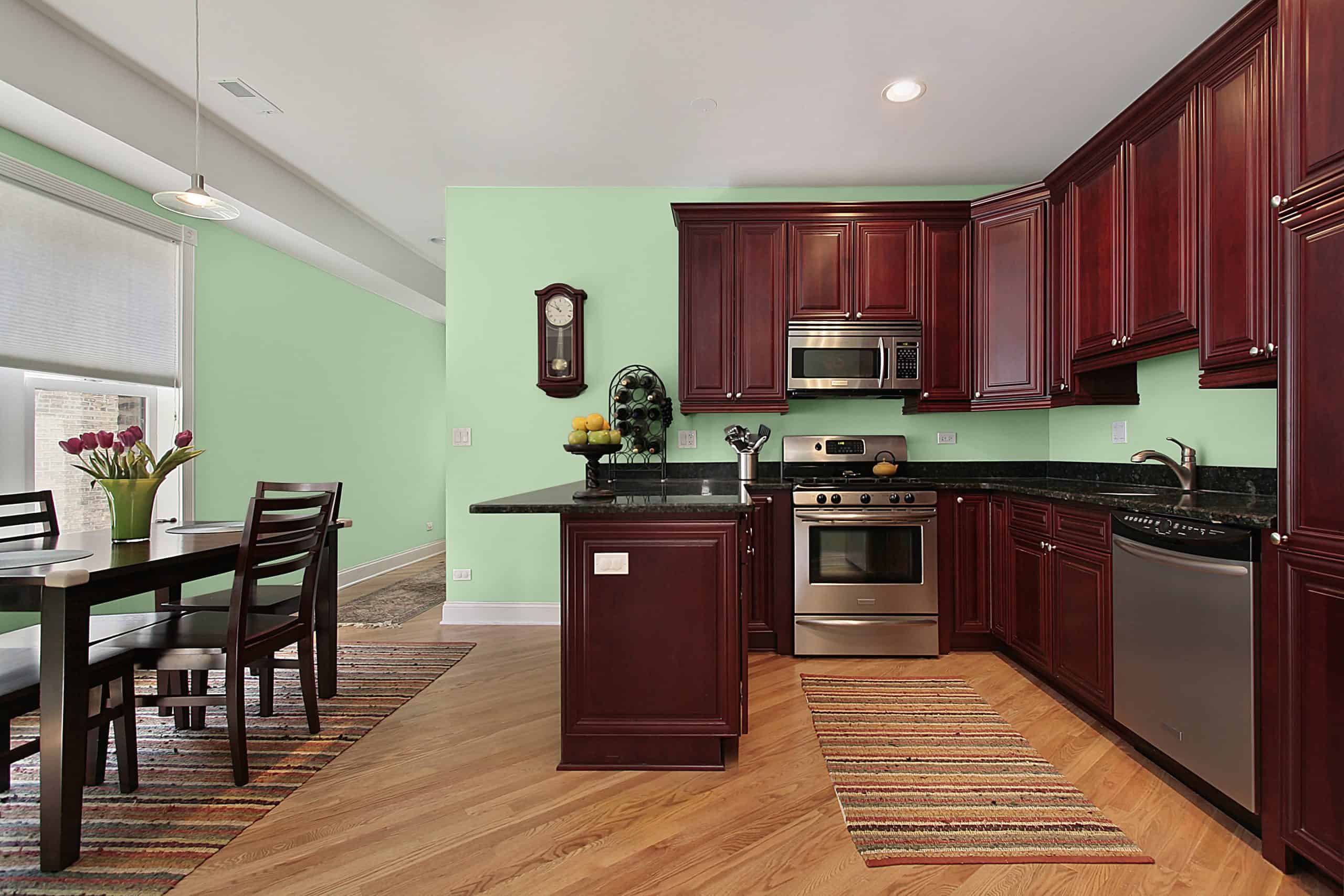
Sherwin William’s Relish is an exciting pastel green with upbeat energy. However, despite its bright appearance, Relish is not an overpowering color. Consequently, it is an excellent match for cherry red cabinets that require a lively but relatively gentle colored backdrop.
Red and green are (almost) on opposite sides of the color wheel. This makes them a brilliant, classic combination that’s perfect for indoor use. Your interior space will look radiant when introduced to the dynamic energy created by your new red and green pairing.
Nicolson Green by Benjamin Moore
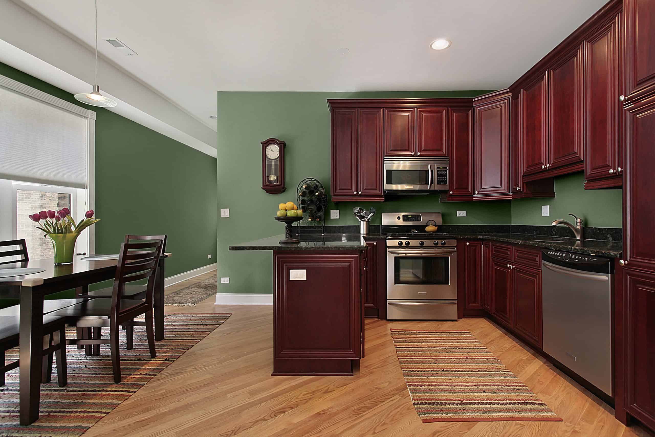
Benjamin Moore’s Nicolson Green is a stronger cousin to Sherwin William’s Reclining Green. However, despite both belonging to the same primary color family, either shade has a unique, incomparable presence.
If you’re looking for a darker, earthy alternative to Reclining Green’s pastel pallet, consider Nicolson Green. We’ve already talked about why red and green work so well together, and Nicholson Green is no stranger to the concept. Additionally, its relative intensity will work well alongside cherry red cabinets.
Quiver Tan by Sherwin Williams
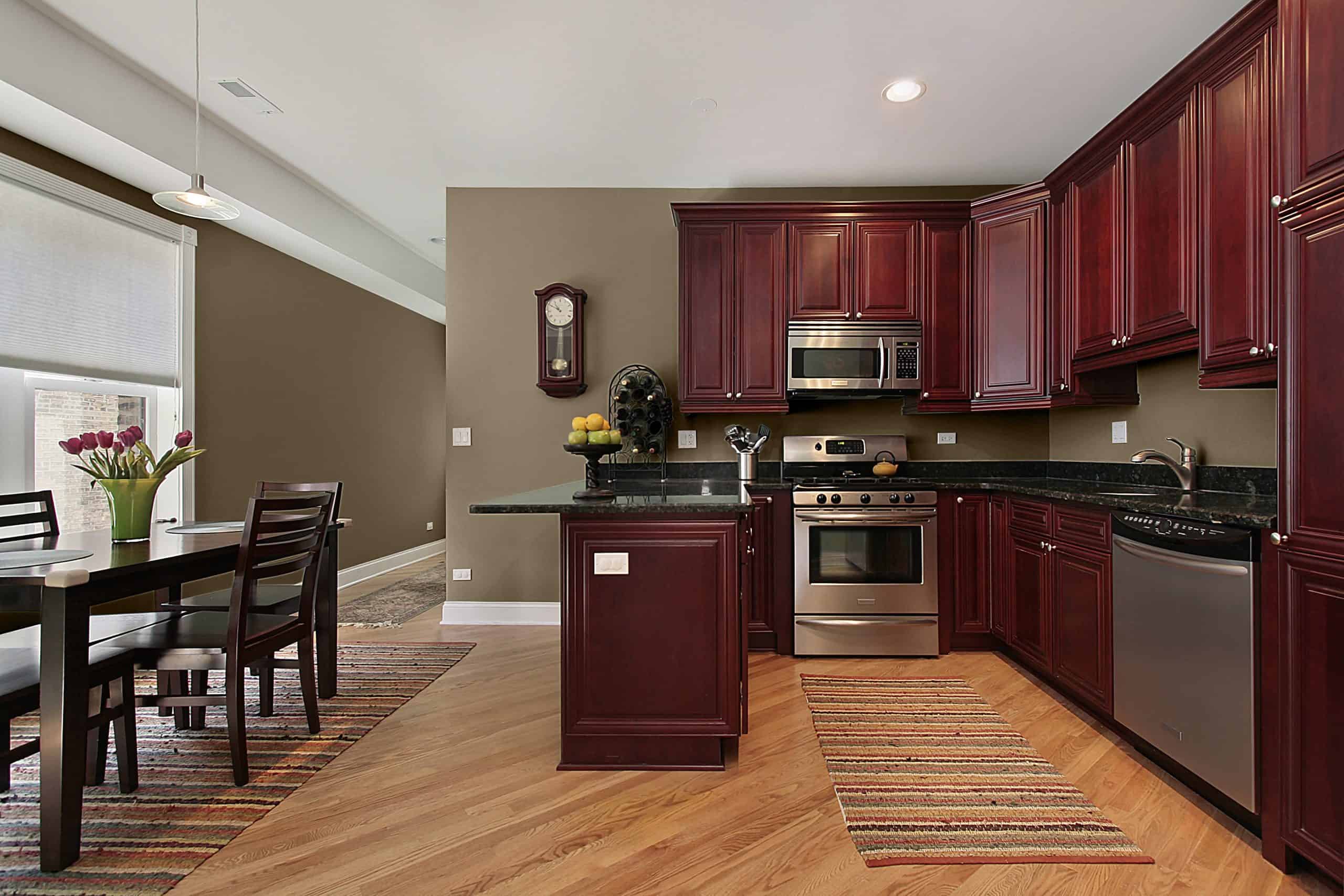
Quiver Tan is a medium-dark, beige brown with earthen energy that distinguishes it from other beige shades. It also has a prominent, grounded appearance similar to cherry red’s unwavering boldness.
Brown and red aren’t too far from one another on the color wheel. This makes them suitable matches for one another, which is why you shouldn’t hesitate to paint your walls with Quiver Tan.
Just stay away from other accents; adding more color to the mix could be a recipe for disaster! This is because both your walls and cabinets will be decked in prominent, colorful shades.
Slipper Satin by Farrow&Ball
Slipper Satin by Farrow&Ball is an unchallenging, smooth beige that is lighter than most shades within the same color family. It has a gentle, welcoming appearance that can help introduce a calm energy to the room.
Cherry cabinets come with a unique brand of fire that’s hard to miss. Though its appearance isn’t as harsh as some shades of red, cherry wood is undoubtedly still a force to be reckoned with!
However, this also means that it’s challenging to find colors that can handle cherry red’s unmatched energy. Luckily, Slipper Satin is one of the few shades that have the potential to tame your cherry cabinet set’s fire.
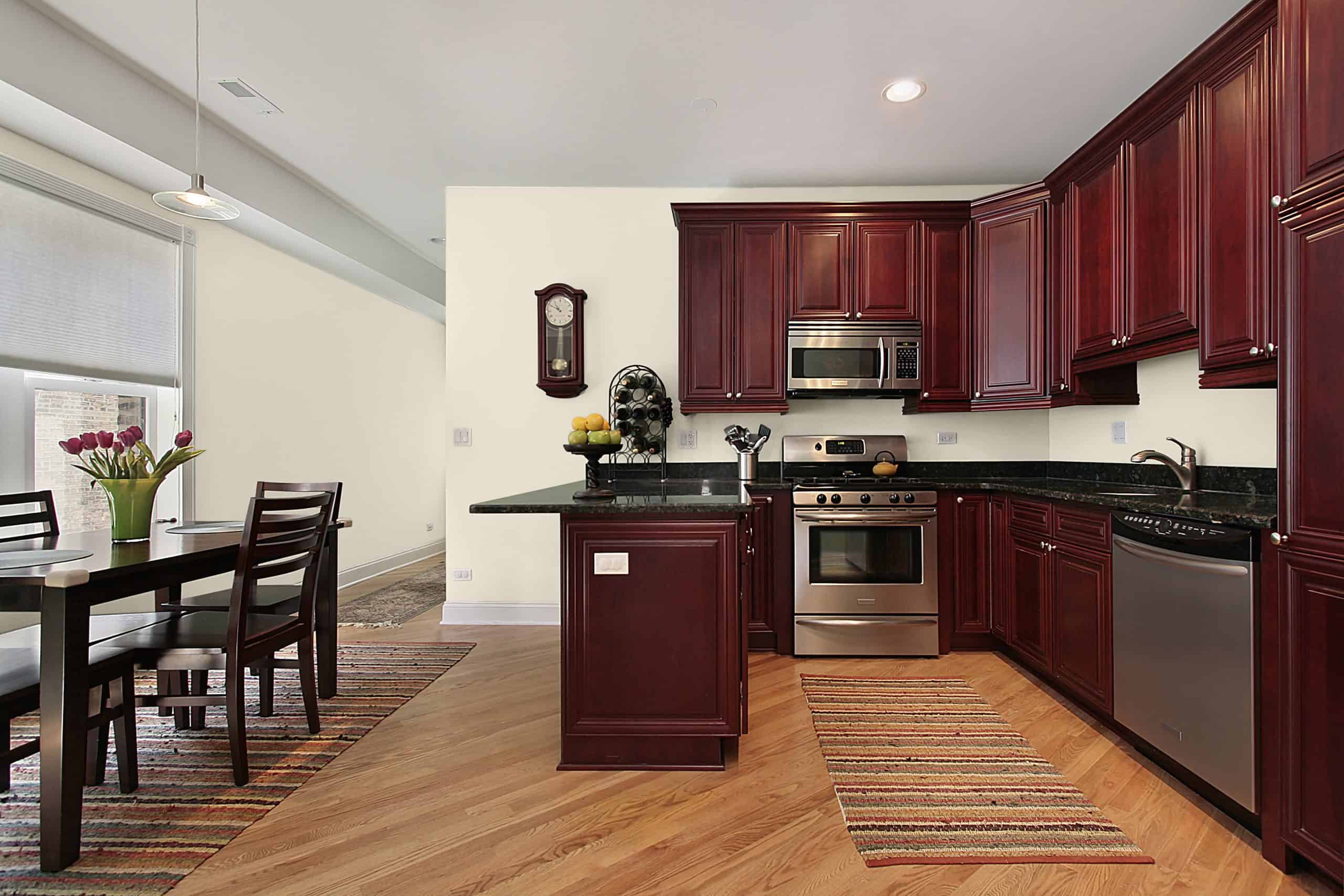
Panda White by Benjamin Moore

Drab, unexciting white walls are seldom a quality match for a color with as much character as cherry red. It’s better to switch out regular snow white for a livelier option, like Sherwin William’s Panda White.
Panda White isn’t your average white paint. Instead, it contains an appealing cream-colored tint that will help bring your walls to life! It’s this same cream-toned appearance that allows it to match well with cherry cabinets. Panda White’s unmistakable warmth will uplift your cherry furniture and give it an undeniable radiant look.
Marshmallow by Sherwin Williams
Panda White may be a remarkable color, but it isn’t the right option for everyone. So, if you’re looking for a color within the white family but prefer something cooler than Panda White, consider Marshmallow!
Sherwin William’s Marshmallow is a relatively cool, cozy shade of white tinged with the slightest bit of warmth. It isn’t as sunny as Panda White, which is why it can’t be categorized as a classical “warm” color. Instead, it has a soft, milky appearance. This makes it an excellent option for homeowners that desire a fresh, unbleached white to complement their cherry cabinets.
Rarified Air by Sherwin Williams
Rarified Air by Sherwin Williams is an excellent option for homeowners who appreciate neutral colors. Despite belonging to the white color family, similar to Panda White and Marshmallow, Rarified Air has an unmatched, unique presence.
Laced with a light blue undertone and gray tint, Rarified Air-colored walls can easily balance out your cherry cabinet set’s intensity. This is because this paint shade’s blue undertone will help introduce a calm aura to cherry red’s passionate approach.
Shy Smile by Behr
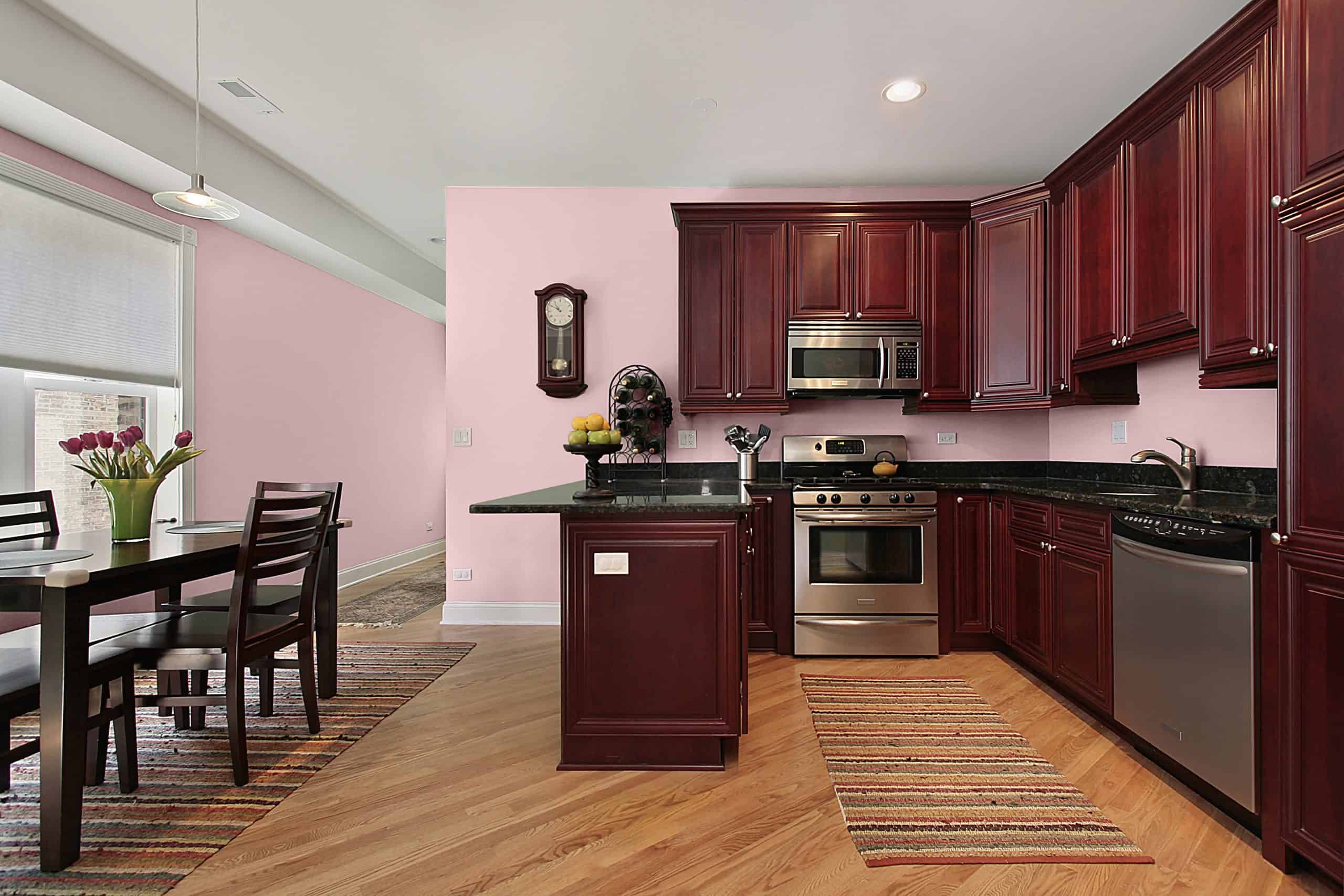
Though unconventional, no rule says you can’t pair cherry cabinets with pink walls. Behr’s Shy Smile is a dusty, mauve pink with an unmistakable charm. Despite its name, Shy Smile is not a passive color. Its gentle yet lively appearance makes it an excellent match for willful, determined cherry red.
Both cherry wood and Shy Smile belong to the red color family. This similarity helps bring the two together to create an exciting fusion of feminine pink and unrelenting red. It’ll also help them blend in seamlessly with one another, hence making Shy Smile an excellent backdrop option for cherry cabinets.
Eclipse by Benjamin Moore
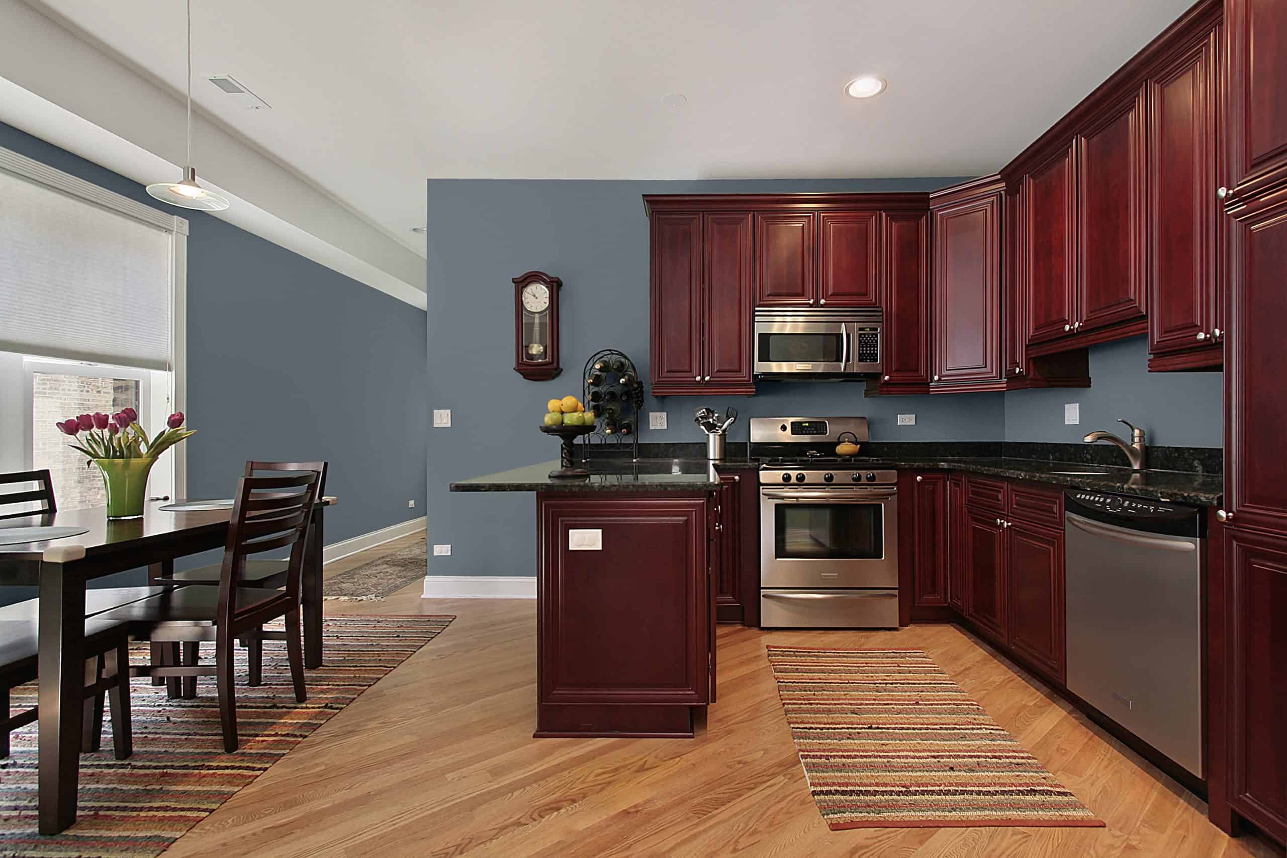
Eclipse is a cool, medium grey with an obvious blue undertone. Its ode to blue gives it a crisp, cool appearance that can instantly refresh a dull room.
Benjamin Moore’s colors never disappoint, and Eclipse is no exception to this rule. This color’s chilly undertone can work well with cherry wood’s red tint. Remember, red and blue are opposites on the color wheel. This makes them natural partners and an excellent, visually appealing color duo.
Gloucester Sage by Benjamin Moore
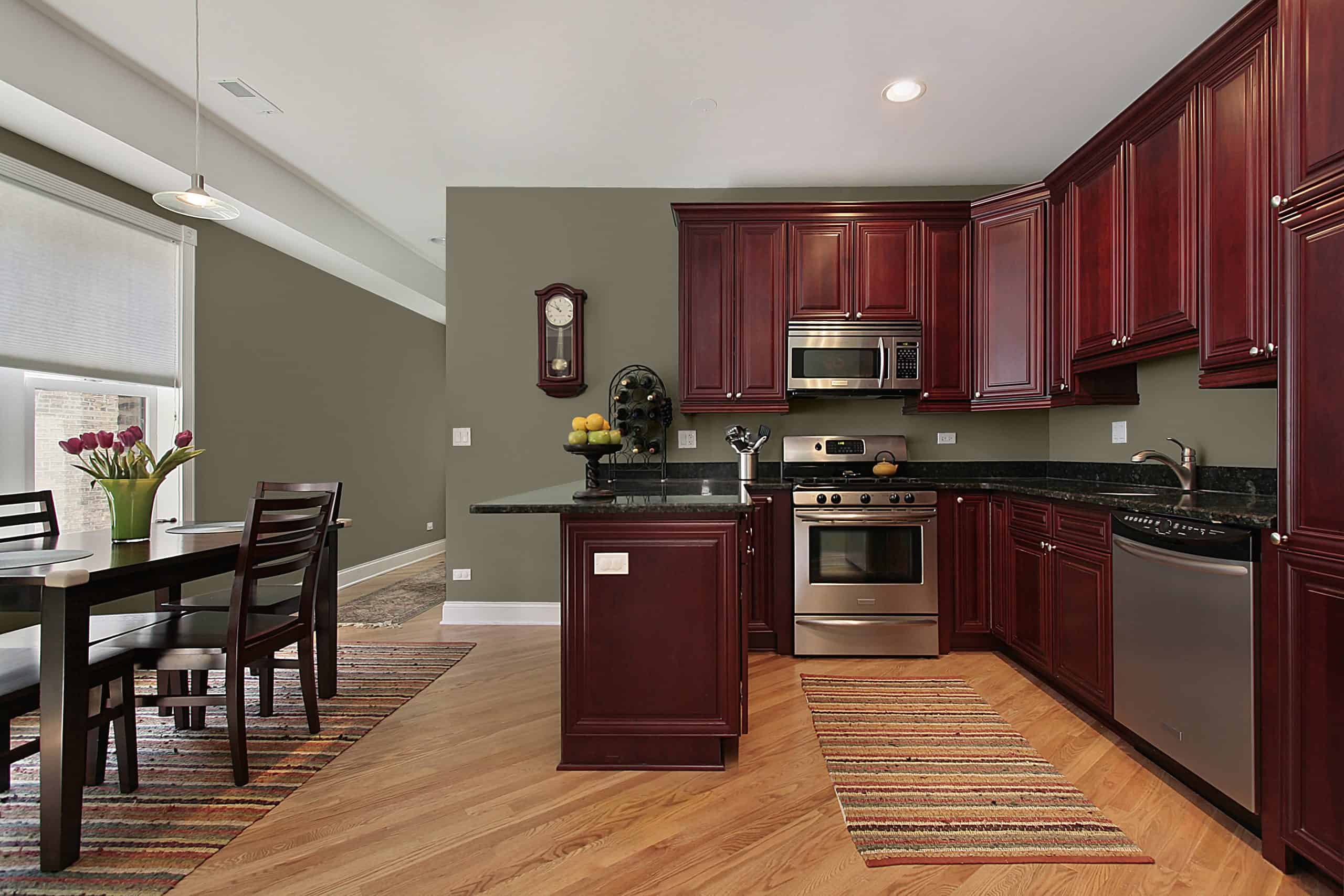
Gloucester Sage is an interesting take on regular sage green. Unlike most greens, this color has an appealing brown tint that gives it character. Brown and green are both excellent complements for fiery red, making Gloucester Sage a wonderful backdrop option for your cherry cabinets.
This shade is also remarkably versatile, thanks to its rich heritage featuring both brown and green. Hence, pairing your Gloucester Sage walls with other furniture or decoration items shouldn’t be a challenge.
Final Words
Finding the perfect color to match with cherry cabinets isn’t easy. Luckily, though, some quick internet browsing can help you solve the puzzle within minutes!
When selecting which color to paint your walls in, remember to consider any other accents within the area. For example, if you have plenty of black within the area, stay away from light-colored wall paints like Reclining Green. Light shades won’t blend well with heavy, dark ones!